Pivot Tables in Microsoft Excel
Got a table with a bunch of data and need to create a graphical representation to impress the bosses? Pivot tables to the rescue!
What exactly is a Pivot Table? According to Wikipedia:
A pivot table is a table of statistics that summarizes the data of a more extensive table (such as from a database, spreadsheet, or business intelligence program). This summary might include sums, averages, or other statistics, which the pivot table groups together in a meaningful way.
How do we create a Pivot Table?
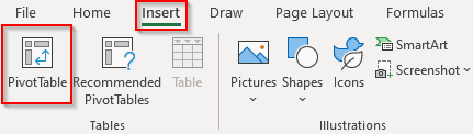
- Select the “Insert” tab of your version of Microsoft Excel
- Select “Pivot Table”
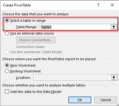
3. A window will open for you to select the data to create the Pivot Table out of.
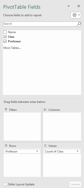
4. A blank Pivot Table will be created with a panel called “Pivot Table Fields” on the right of the Excel window to select the data you want to summarize.
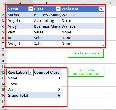
Congratulations! You’ve just created a Pivot Table.
This isn’t the end! There is so much more you can do with your Pivot Table. You can add graphs easily and even include those graphs in a PowerPoint presentation. Also, those graphs can be dynamic and updates as the Pivot Table updates.